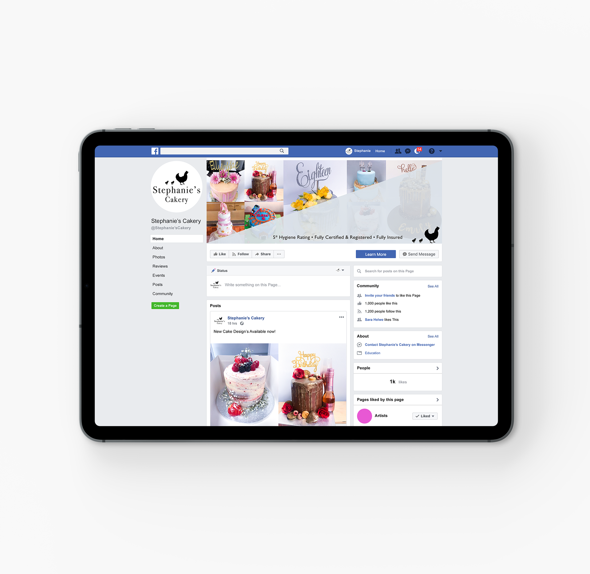
This project involved the complete rebrand of the company, Stephanie's Cakery. The business wanted a fresh look that displayed an approachable, friendly, local and homely cake baker. During this project, I learnt how important communication skills between myself and a client is. The idea for the hen imagery came from the fact that she was a mother of two small children, so I played on that with the 'mother hen and her two chicks'. I kept the promotion simple and clean to display the look that the client wanted, while still keeping using the imagery I made.

